Setting Music in Motion
Six artists explain how they used animation to bring music to life for the Australian Chamber Orchestra’s 2020 season.
Long before the Australian Chamber Orchestra had to cancel its celebratory 2020 season honoring Art Director Richard Tognetti’s 30-year anniversary due to COVID-19, the ACO’s marketing agency, Moffitt.Moffitt, asked Sydney motion studio, Substance to design a special suite of animations to highlight the season’s significance.
Designed around six different musical compositions chosen by ACO musicians, the animations were created by Substance’s Founder and Creative Director Scott Geersen, in partnership with five leading motion artists he tapped from around the world— Nidia Dias, Helen Hsu, Rory McLean, Rich Nosworthy and Martina Stiftinger.
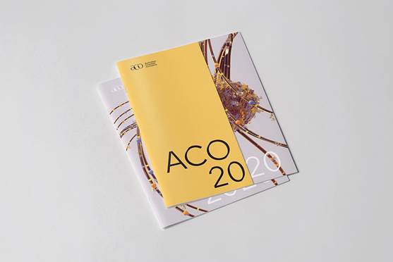
Made using a variety of tools, including Cinema 4D, Houdini, Redshift, ZBrush and Maya, the animations’ designs were also used for all aspects of the ACO’s 2020 campaign, including print and digital media, posters, programs, the website and social channels. Though Substance collaborates regularly with Moffitt.Moffitt, this was the studio’s first experience working with the ACO. “This project really relied on a lot of input from the musicians themselves because they all wrote notes or did short interviews about why they chose each piece of music,” Geersen explains.
Part of the concept for the animations as a global collaboration was that the music comes from all around the world, just as many ACO musicians do. “And their interviews and notes were so important to us because we were able to get insight into what the pieces meant from each musician’s point of view,” he recalls. “We could hear it in their voices. If we had just made the animations on our own, they would have turned out differently because their input was so personal.”

Researching the musical compositions was also a key part of the project, Geersen says. ACO subscribers are mostly aficionados who would expect the visuals to reflect what was behind the music, so Substance studied everything from each composer’s background to the history and political environment during which each piece was written. All of that research was passed on to the artists involved in the project, along with the artists’ notes, visual references and a request to use the ACO’s 2020 seasonal color, yellow. The intention was that ACO subscribers would recognize the links between the music and visuals, new subscribers would be captivated by the imagery and want to know more.
“We wanted to give each artist a starting point,” Geersen recalls, “but reactions to music can be quite personal so it was important to the ACO that each of us put our own ideas into our visuals.” In addition to creative freedom, the artists also appreciated that the visuals they created were used not just for animations, but also the ACO’s 2020 print campaign. “It’s rare that we ever get to make something physical but, in this case, we all got to hold what we created in our hands,” he says.

Substance and Rich Nosworthy
Working closely with Moffitt.Moffitt, Substance and the other five artists collaborated using Slack and Dropbox so that everyone could see what each person was doing. Geersen helped steer the direction of each artist’s work on his or her piece while also making his own animation for Gustav Mahler’s Song of the Earth. “Substance cut down the full tracks to become recognizable moments, and then each artist put forward their preference,” he says. “Having that choice was important because the point of the collaboration was about how the music speaks to us all, musicians and designers.”
Inspired by ACO musician Maja Savnik’s interpretation of Mahler’s composition, Das Liede von der Erde, Geersen chose an animation design depicting optimism and rebirth in a surreal life-filled garden of blooming flowers and a “ballet of dewdrops, petals and bejeweled insects.” Redshift’s AOV’s were crucial to developing the look, he says. “Because there is no real color in the textures themselves. Everything in the scene is made of weathered gold, so all of the color comes from reflected lighting.”
Just as a photographer would use colored gels, Substance used a three-color light setup along with light passes to build and intensify the effect in comp. “The ability to render, not just beauty, but reflections and spec passes per light, gave us an incredible amount of post-processed art direction,” Geersen says, adding that they also used multiple HDRIs in each shot to dial in different effects. “But we only needed to render once thanks to the way Redshift’s light passes work.”
For Francesco Geminiani’s La Folia, New Zealand-based 3D designer Rich Nosworthy focused on the idea that the composition was highly structural, essentially a forerunner to today’s more modern musical arrangements. “We thought it would be interesting to have the animation based around hard, geometrical forms that shift and move to the music, forming and pulling apart larger shapes as the piece progresses,” he says explaining that he used recursive loops and Booleans inside of Houdini for most of the animation.
Nosworthy used Redshift’s shader switch to mix various shaders in the geometry, as well as a couple of geometry attributes to randomize their distribution and tweak various shaders’ colors and textures. “Redshift gave us a great deal of control by allowing quick look development of our shots along with the ability to easily change the color or texture of any piece at a particular time,” he recalls. “I was even able to create various custom mattes and masks, taking different attributes from the geometry, mixing the values and piping them into secondary outputs for comp. That level of custom control is something I’ve struggled with in a lot of renderers in the past.”
Martina Stiftinger and Rory McLean
From the start, UK and Austria-based Designer and Director Martina Stiftinger was fascinated creatively by Vaugn Williams’ The Lark Ascending. She based her visual concept on the way the composition “starts very rich and full-bodied and then develops a beautiful fine, airy lightness.” She chose a single feather as a means of visualizing that uplifting experience, and the set design was inspired by the Williams’ background as a British composer connected to the countryside and pastoral art.
Visual development began with highlighting and celebrating the feather as the hero element and spline setups were used to define complex feather structures for macro shots, close-ups and full shots. Rigging the feather was quite simple, as the main shaft was keyframed and hand-animated in Maya. The barbs with the barbules were simulated based on their constraints to the shaft. “The feature that allows you to render the splines directly as a Redshift Curve Object is brilliant,” Stiftinger recalls. “It was exactly what I needed for this kind of animation setup.”

Redshift also made her workflow easier, especially during the look development and design process when shapes, color palette and materials were changing a lot, depending on aesthetic considerations and requirements. “Redshift’s PostFX options, like color grading, color management and LUTs (lookup tables) are very powerful for designing cinematic looks directly in the render view,” she explains.
Rory McLean, a freelance 3D artist in Australia, chose to create an animation for Shostakovich’s Chamber Symphony. With a goal of “representing the oppression of the Soviet state with an abstract depiction of imposing brutalist architecture,” he explains that because he had to quickly iterate on the shapes and designs of the building blocks, proper modeling and unwrapping of every piece was not really an option. “Instead, I constructed everything out of primitives and cut the desired shapes using Booleans,” which kept everything procedural allowing him to change things up very easily and quickly.
A couple of Redshift tools helped keep things moving along smoothly too. “With TriPlanar projection, I didn’t have to have nice UVs on everything,” McLean recalls. “I could just throw a PBR material on the Boolean geometry, and the texture looked perfect straight away.” Redshift’s Rounded Corners shader meant he didn’t have to bevel all the hard edges on the geometry, “which would have been incredibly difficult or impossible on that messy Boolean geometry,” he says, adding that the Curvature shader allowed him to create a nice mask for edge wear or darkening.
Helen Hsu and Nidia Dias
Shanghai-based Director Helen Hsu chose Ludwig van Beethoven’s Eroica symphony. Knowing that the piece was originally dedicated to Napoleon prior to the French Revolution when Beethoven became disenchanted with the ruler, Hsu chose a mix of visual elements suggesting war, rulers and liberty.
The animation was made using a combination of different software, ZBrush and Substance Painter for the crown, Daz3D to make the hands and X-Particles for effects. Hsu used Marvelous Designer for the striking flag simulation, and everything was rendered in Redshift, which she has been using for the past couple of years.

Nidia Dias is an art director and designer in Portugal. Her animation for Arvo Pärt’s Tabula Rasa was inspired by the ACO musician’s note she was given explaining that “Pärt’s genius is being in touch with the physical and the divine in such a compelling way.”
Working in collaboration with her husband, Martin Gunnarsson, they came up with the idea to create a divine creature of their own that would flow with the music but not be tied to any particular religion. “The idea was to simplify it into splines/lines that would move freely in this infinite space, and we would bring life to this creature almost like these splines were wings, flying with the music,” she explains.

While Dias handled the art direction, design and look dev using Cinema 4D and Redshift, Gunnarsson used Maya for the simulation and rigging. “Redshift was a great tool to use for this project because, being GPU based, it was so fast for look dev,” she says. “Redshift also came in handy because we were using splines as our main geometry and it renders splines by simply adding an object tag,” she continues. “It was such a great project to be involved in, and not just the animation but also how the visuals were used across ACO posters and flyers.”
© Copyright 2000-2026 COGITO SOFTWARE CO.,LTD. All rights reserved. 京ICP备09015132号-52